Case Bovision
Project details
I've worked at Bovision as a freelance UX-designer and my work has consisted of different areas of design while redesigning their platform and expanding their Graphic Manual. The company is a digital property platform and mainly has three types of users; real estate agents, users who are selling their properties and users who are looking for properties. Most of their users (up to 70%) use their website mainly from their phone which led to the current design being focused on mobile rather than desktop.
I worked at Bovision as a freelance UX-designer for about two months and had three main tasks that made up my project there. As a freelancer I had full responsibility for how and why I chose my designs to present to my client which was both exciting and a challenge. This entire project was completely up to me and my own ability to create without much to go on. I was instructed to both present something that could be used today that would also be totally crazy and out of the box. Someone could say that's the definition of not knowing what you're looking for but I was determined to find out exactly what that was! My main three tasks were designing mockups, creating two chapters for their Graphic Manual and lastly designing a Press Kit.
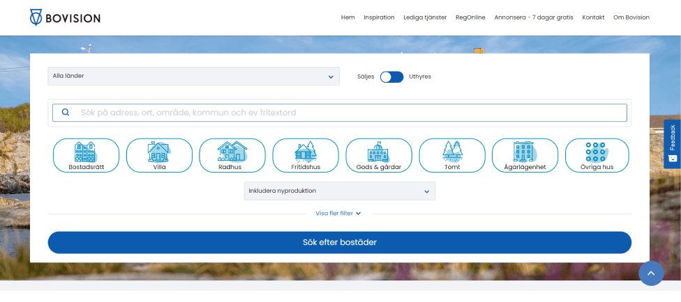
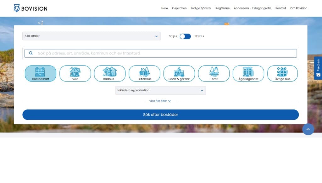
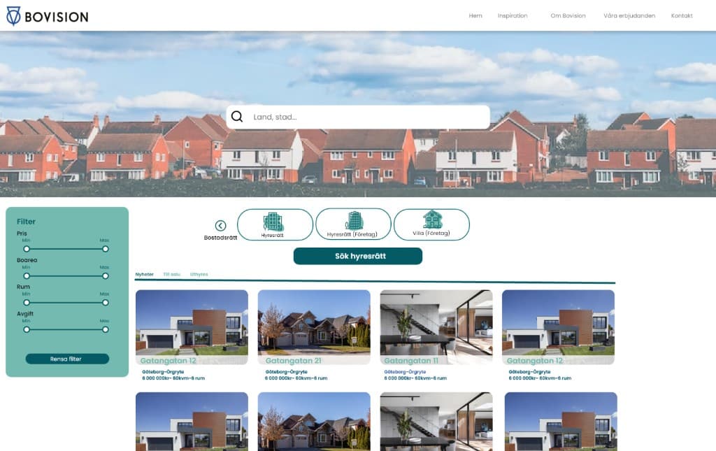
I designed a couple of different mockups for the search engine for the house advertisements and for the inspiration page that contained articles. I started off doing a simple analysis of the current design by using Nielsen's 10 heuristics to look for potential problems and user errors. From my results I then designed a simple but improved search engine that wouldn't be too difficult to implement. I created my own icons for the different types of houses since this also was a part of their rebranding and was a specific request to redesign. The feedback I got was that it was boring and looked too much like Hemnet, their biggest competitor.
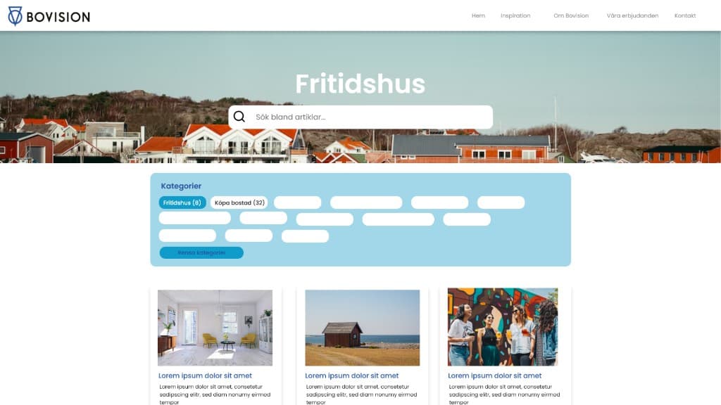
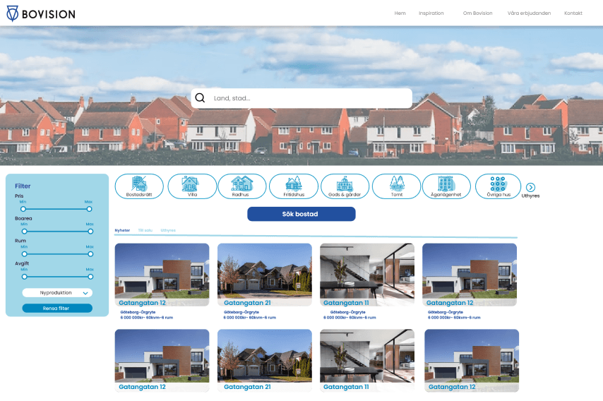
I made a second design where I made bigger changes, for example I moved the search filter to the left to make it more visible yet take up less space. I chose bigger icons for the types of houses and changed the colours to a more subtle and warm tone. Since they also offer rentals I chose to change the colour to green when you switched to look at them to make it more obvious for the user. When I presented this I was given the feedback that this was too different and would be hard to implement currently. After discussing the design we decided to at least implement the new house icons which I would say was a win!
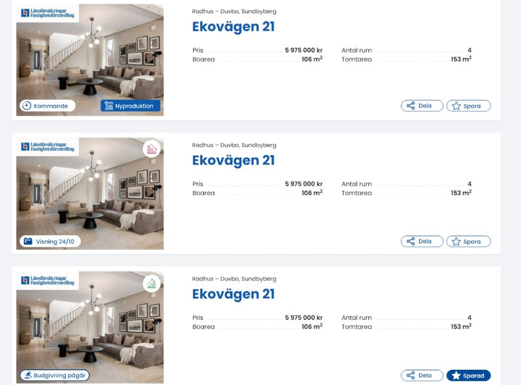
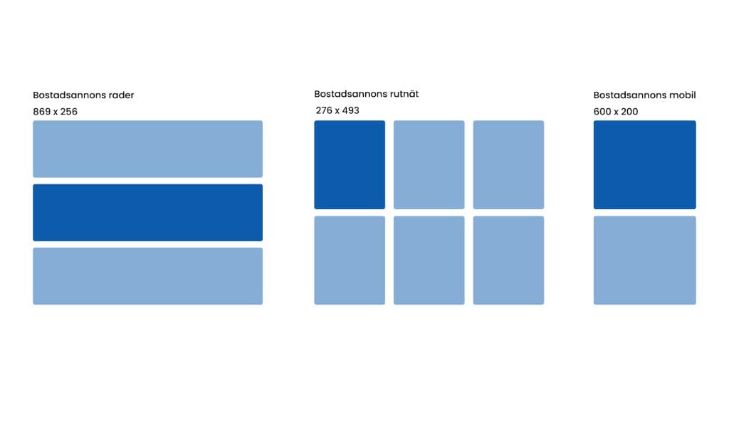
The Graphic Manual needed a chapter about their icons, both new and current ones, and a chapter about their design systems. With this task I quickly ran into trouble as I realised there wasn't much information about what icons were needed and what they would be used for and just the entire idea of creating a design system by myself. I explained my concerns to my client and we discussed what icons were needed and how they would be used. Since Bovision was currently in the process of rebranding it was important that the icons served a purpose and looked somewhat more modern and different from the current ones. Some of the icons were part of new functions that were not yet implemented. The design system that I created was only the very basics of what a design system can entail. Since the company was in the beginning of a rebranding it meant that almost everything of their current web design would soon be replaced. This meant that I couldn't put much content into the chapter since it wasn't yet decided. What I managed to gather was that the layout of articles and advertisements would stay the same so that's all I did.
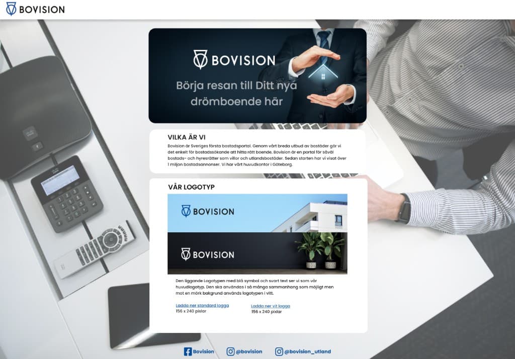
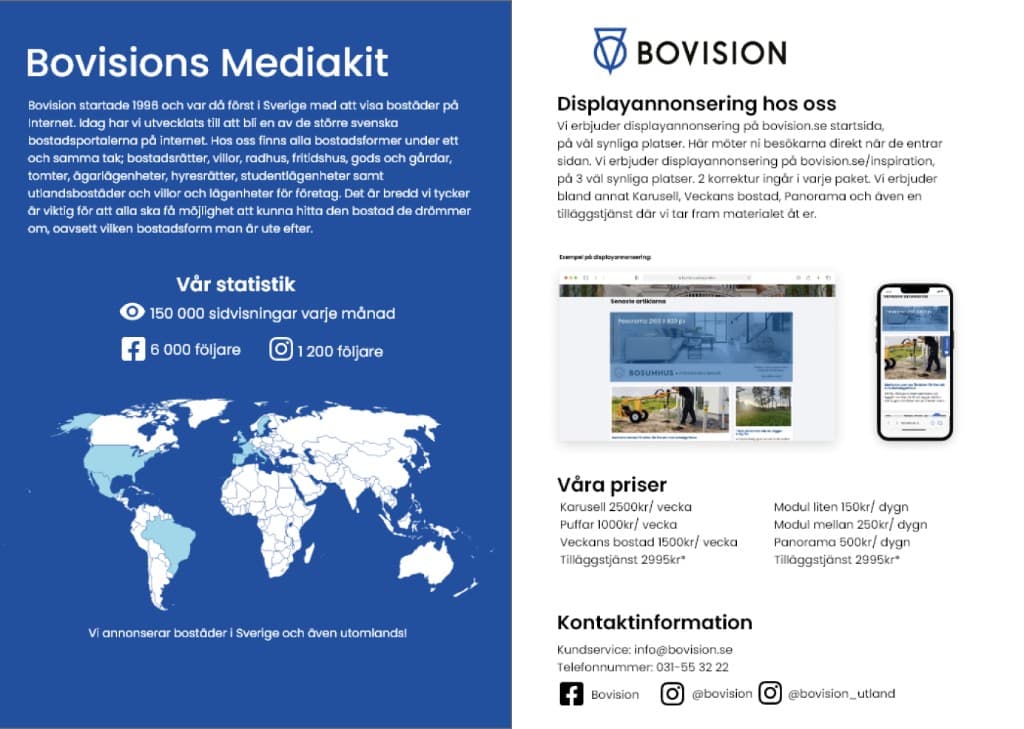
My last task during the project was designing a Press Kit that would be available on their website. This task started off strong with me misunderstanding what my client wanted the Press Kit to contain. I had to find the content myself which led to me making the best out of the situation and was then given feedback that it was the wrong content and had to be redone. Because of this misunderstanding, what I ended up creating was a Media Kit and a Press Kit even though I was only supposed to make the Press Kit.
My conclusion of this project was that I learned a lot the hard way. It's hard to know what you want and even harder designing for someone that doesn't know what they want. Most of what I made during this project was as a graphic designer rather than a UX designer. I was very optimistic when starting this project and what I think worked to my advantage was asking the questions that are important to me and my process. This doesn't mean they'll always have an answer but I know my efforts will eventually pay off.